 Basics of Flower Arrangements and Artistic Plantings – a Beginner’s Guide
This Article, written anonymously, appeared in the African Violet Magazine May/June 1991.
Reviewed for accuracy, February 2020, by Joyce Stork
ELEMENTS OF DESIGN
Space
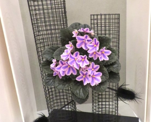
A design should visually fill the space contained by the niche by using 3/4ths to 7/8ths of the height of the niche. If the niches are 24 inches high, the highest point in the arrangement or artistic planting should be from 18 to 21 inches above the top of the table.
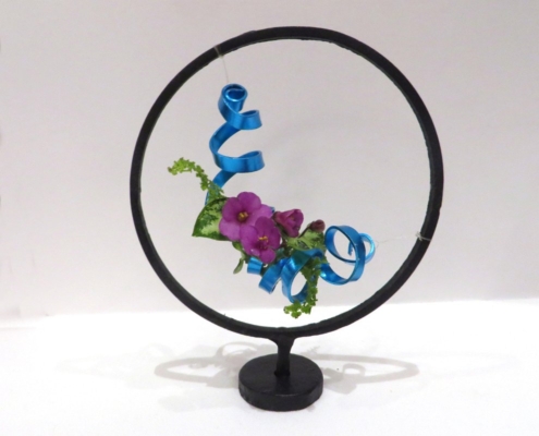
Not only does your design fill the space within the niche, it should visually contain space within it. Without some open area within the outlines of the design, it will appear heavy and will present the viewer with a solid mass. Empty space is as important to design as filled areas. Without space, sculpture would merely be a block of marble.
Line
Line is the source of visual motion and is the foundation around which the rest of the design will be built. The most common line shapes used by African violet designers are the crescent and the Hobart or “S” curve. Both shapes convey a restful feeling of motion to the viewer. Strong vertical, diagonal or horizontal lines convey sharp and dynamic movement in interpreting your class in the schedule: decide whether your design should be restful or dynamic, soft or abrupt.
Pattern
Pattern is the skeleton of the design. When you feel that you have an idea for an arrangement or planting, it is helpful if you sit down with pen and paper and draw a picture of what you want the silhouette of the design to look like. The type of line you will use, and the basic shape of the design should be firmly in your mind before you begin working with the actual plant material.
Although you need not be precise, you should try to illustrate to yourself the proportions of what you are trying to create. The silhouette drawing is an essential step in creating a well-thought-out design. It is much easier to modify your drawing than to try to rethink a design when the flowers, line material and filler are already cut.
Form
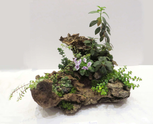
Form is the three-dimensional shape of your design. Every design must have this third dimension of depth to complete it. If you choose to work with dried, treated or painted material, you will be able to create your design ahead of time and study it to ensure that it creates the effect that you want to achieve.
Texture
Texture adds interest to the design. It may be rough or smooth, coarse or fine. Plant material, containers, backdrops and accessories all have their own distinct textures. Each have their own “feel.” Use texture to convey the desired feeling of the design.
Color
Color adds excitement to design. Refrain from using too many colors. White is “‘no color” and black is “all colors.” Both may be used freely.
Red, maroon, wine, purple, indigo and blue are all different tones of the primary colors blue and red. These may clash if used in the same design and be distracting.
Deep purple, medium purple and light purple are all shades of the same amounts of the colors red and blue with varying amounts of the “no color” white. Using shades is often pleasing.
PREPARATIONS AND MECHANICS
Read the schedule thoroughly, and be sure that you understand all the requirements.
Try to interpret the theme of your class without being too obvious about it. Your design should suggest the theme without “beating the viewer over the head,”
It is often best to make your design at home and bring it to the show. Add only the blossoms and finishing touches at the show. Anchor all holders firmly. All live materials must have a source of moisture to last through a two-day show. A kenzan (pin frog), oasis foam, or the caps of hypodermic needles can be used to anchor plant materials and provide moisture. Picks can be used to raise plant materials to the desired position if there is a supply of moisture, and the mechanics are not easily visible from the front of the design.
CONDITIONING MATERIALS
Violet blossoms should be plucked the night before the arrangement is made. Remove from the plant with the longest stem possible. Then re-cut the stem on a slant and immediately place it in tepid water. The blooms should be tented with a loose covering of plastic to keep humidity high. Other foliage materials should be completely submerged in water overnight if possible. Many designers purchase plants at a show to use its blossoms in their designs.
MATHEMATICS OF DESIGN
Blossoms, lines, and other material look much better when shown in odd-numbered groupings. When using three main lines, try for proportions of 100%, 50% and 25%. That is, the middle highest line should be ½ the height of the highest; the shortest line should be ½ the height of the middle line. These three lines will then form a triangular framework for the design. Keep other materials within imaginary lines between the ends of these lines.
A tall container should not exceed ½ the height of the arrangement. The tallest stem should be 1-½ times the width of a low container. Blossoms, lines, and other material look much better when shown in odd numbered groupings.
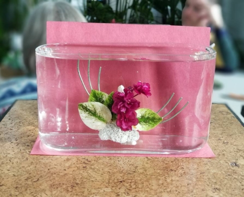
Containers should be a neutral color if you cannot exactly echo one of the colors in the arrangement. Clear glass containers require that the stems be attractively placed, and beginners should usually avoid them.
Conclusion
Remember that these tips are important for beginners to keep in mind; an experienced, award-winning designer may not always follow these suggestions. Instead they may deliberately use stronger contrasting textures or colors which visually clash in order to more fully express their interpretation of the schedule.
You should, therefore, not regard these recommendations as a “rule” which must be followed, but only as advice. When you begin to feel comfortable with your skill as a designer and have a few blue ribbons to your credit, don’t be afraid to experiment!


